Color Psychology in Hospitality Design: How Palette Choices Impact Guest Experience and Behavior
The Science Behind Color Psychology in Hospitality
Color influences us on both conscious and subconscious levels, triggering specific emotional and physiological responses that directly impact the hospitality experience. Red stimulates appetite and creates excitement, explaining its prevalence in fast-casual restaurants seeking quick turnover. Blues and greens induce relaxation and trust, making them valuable in hotel spaces designed for unwinding. Meanwhile, purples convey luxury and creativity, often appearing in upscale venues aiming to create distinctive experiences.
These responses aren’t merely aesthetic preferences—they translate to measurable behavioral changes. Strategic color application has been shown to influence everything from dining duration and check averages to booking conversions and guest satisfaction scores. When we design hospitality spaces, we’re not just selecting colors that look appealing; we’re crafting psychological environments that shape decision-making.
It’s important to recognize that color experience is highly contextual. The same hue produces different responses depending on lighting conditions, surrounding materials, cultural contexts, and the specific hospitality setting. This complexity demands a nuanced, conceptually-driven approach rather than the application of universal color “rules.”
Strategic Color Applications for Different Hospitality Settings
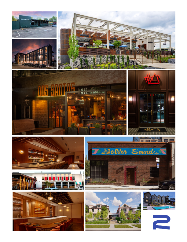
Restaurant color strategies must align with both concept and operational goals. Fine dining venues typically employ sophisticated, muted palettes in deeper tones—rich burgundies, forest greens, and navy blues—creating environments where guests linger comfortably while encouraging wine and dessert orders. In contrast, fast-casual concepts often leverage higher-energy complementary color schemes that stimulate quick decision-making and efficient turnover.
Hotel public spaces require careful color transitions that guide guests from high-energy exterior environments to more intimate interior experiences. Lobbies often balance welcoming warmth with brand-expressive color moments, creating memorable first impressions while facilitating the psychological transition from travel to arrival. The most successful hotel color strategies create a coherent journey from entry to guestroom, with thoughtful transitions that support the changing emotional states throughout a guest’s stay.
For private guest spaces, color psychology focuses on comfort and wellbeing. While neutrals provide versatility and timelessness, strategic color accents can dramatically enhance the emotional impact of a space. Cool-toned rooms promote better sleep quality, while warm accent elements create a sense of welcome. The most successful guestroom color strategies balance these physiological responses with brand expression and local context.
Developing Brand-Aligned Color Palettes
Translating brand personality into color strategy requires deep understanding of both color psychology and brand positioning. A boutique hotel emphasizing authentic local connection might draw color inspiration from the surrounding landscape, while a design-forward restaurant concept might leverage unexpected color combinations to signal innovation and creativity.
Signature color moments provide powerful brand reinforcement when strategically deployed. Rather than applying brand colors universally, we identify specific touchpoints where distinctive color creates maximum impact and recognition. This focused approach creates memorable brand associations without overwhelming the overall design.
The most successful hospitality color strategies balance timelessness with contemporary relevance. By anchoring core palette elements in enduring psychological principles while incorporating trend-responsive accents in easily refreshed applications, we create environments that remain relevant without requiring complete reimagination as trends evolve.
Color in Context: Holistic Application Considerations
Color never exists in isolation—it’s experienced through complex interactions with light and material. Natural light showcases color differently than artificial sources, with time of day and seasonality creating further variations. Material properties like texture, reflectivity, and pattern dramatically affect color perception, with the same paint color reading differently on different surfaces.
Cultural and regional influences add another layer of complexity to color application. Red signifies luck and celebration in Chinese contexts but may evoke different associations in Western or Middle Eastern settings. The most successful international hospitality brands develop nuanced color strategies that respect these cultural dimensions while maintaining global brand cohesion.
Scale and proportion fundamentally affect color impact. A vibrant hue that energizes on an accent wall might overwhelm when applied throughout a space. Strategic use of the 60-30-10 rule—where dominant, secondary, and accent colors are proportionally balanced—creates visual harmony while allowing signature colors to make maximum impact.
Color as a Strategic Business and Experience Tool
When approached strategically, color becomes more than an aesthetic choice—it’s a powerful business and experience tool that drives tangible results. By understanding the psychological underpinnings of color response, aligning palette development with brand positioning, and considering the holistic context of application, we create hospitality environments that not only look distinctive but actively support business objectives through enhanced guest experience.
The most successful hospitality designs treat color as a fundamental narrative element—one that creates authentic connections, guides behavior, and transforms ordinary spaces into memorable experiences that guests seek to revisit and share.